
 We spend every single day of the year on this blog talking about music. The highs, the lows, the marshes of the meh. Occasionally, we give a nod to an especially beautiful cover (or an especially heinous one) to buff our word count for the article, but it’s barely a condiment on the edge of the buffet plate, stacked with pretentious slop, that we throw casually in front of the voracious readership. But this one time a year, I don’t have to talk about the music at all. For the third time, I get to pull on my tweed jacket, put on my bottom-rimmed glasses and pompously swirl a glass of expensive-looking box1 wine, as I break down the best and, for the first time, the worst art of the year, in what is sure to once again be the most contested article since the last time I did this.
Once more, a quick rundown on the rules, because I know none of you remembers and like 2 of you went back to the previous installment. The album must have been reviewed on Angry Metal Guy. That includes TYMHM reviews. I am not sifting through 3000 or so albums, the 800+ we have reviewed are quite enough! Some last-minute TYMHM entries may have been too late for consideration, to which I say: tough titty.
One entry per artist, lest we end up with 4 Kantors and 5 Lewandowskis. I’m sure some of you may like that idea, but this is a bit of a celebration of the diversity of metal artwork, so let’s stick to that concept. No re-using of public domain paintings, also known as the “We’ve All Seen The Course Of Empires” rule. This may exclude some awesome-looking covers, but there’s not much creativity involved with choosing an image proven by centuries of worship and using it as your cover. Sorry Solstafir. And with that, let’s begin!
THE WORST
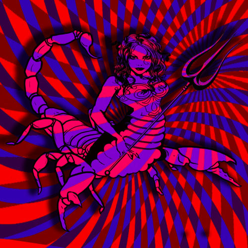
#3. The Atomic Bitchwax // Scorpio — You can’t truly appreciate the best until you have seen the worst. So, in the spirit of the burning puddle of toxic garbage juice that is 2020, let’s first take a look at what the worst 3 covers look like, starting off with the utterly garish nightmare that is the art for Scorpio. The Atomic Bitchwax are a fun lot, and Scorpio is no different, but the art has sure taken an absolute nosedive since their last album. It looks like the drawing was pulled from a long forgotten ClipArt drawer, only to be squashed and stretched and photocopied twice by each member of the band in sequence, and when it was made as ugly as it could possibly be, they attempted to cover up the mistreatment by adding a color pattern that’s downright painful to look at. I can hardly imagine this is anything else than a joke stretched far beyond the point where they can not do anything but commit.
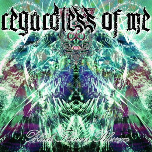
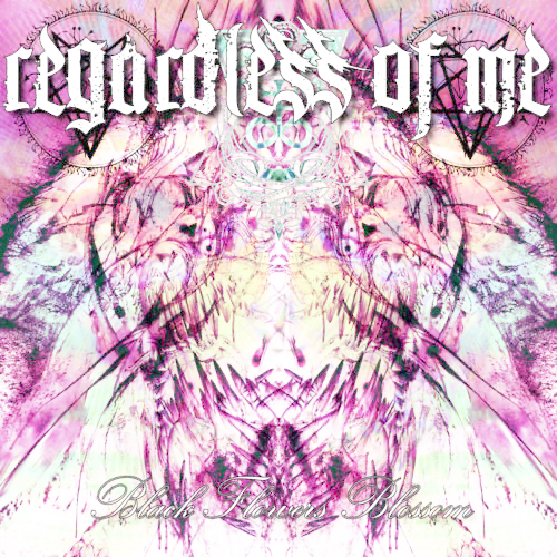
#2. Regardless of Me // Black Flowers Blossom — What even is this? Who approved this? This is like Ed Hardy going through the worst acid trip of his life. It looks like the remnant of a decade long attempt to come up with a color that does not exist. It’s the face of God drawn by someone having a seizure on top of a pallet of outdated Photoshop copies. The colors are such a mess, I honestly thought inverting the colors might actually improve it, but it’s just a different flavor of awful. Capped off with terrible font choices, it took something truly special to dethrone this dreck as the worst the year had to offer.
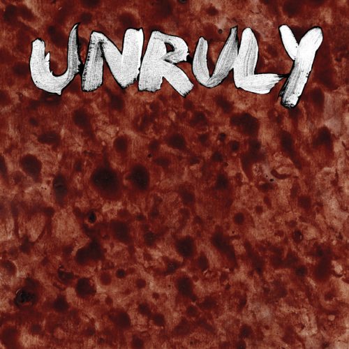
#1. Unruly // Unruly — As terrible as Regardless of Me is, it at least has the air that someone put some effort into it. It’s the polar opposite of the ultimate boring cover; a name on a blank slate. Unruly somehow manages to look like less thought went into their cover than that, though. Their logo is a smear, as if traced from a painting in shit from a public bathroom. I don’t even know what the background is supposed to be. A closeup of a menstrual sponge? A medical burn? A distant aerial shot of a WWI battlefield? I don’t know, and I don’t care. It’s hideous and stupid and doesn’t even have the courtesy of being shit in an entertaining way. This is the most 2020 cover of 2020.
THE BEST
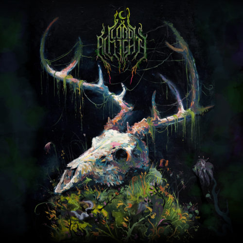
#(ish). Lord Almighty // Wither (artist: Adam O’Day) — Art can be great for a lot of reasons. The art for Wither is great for its invocation of a very particular mood; a memento mori of a sort. The blooming flowers contrast beautifully with the harsh starkness of the largely black and white skull. The layout is a tad empty altogether, but the way the foliage intertwines with the antlers, the integration of the logo and the spots of color on the skull are all very satisfying to behold.
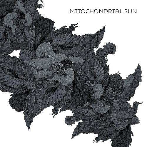
#(ish). Mitochondrial Sun // Mitochondrial Sun (artist: Niklas Sundin) — As far as I could tell, Sundin is the only musician on this list who designed his own cover. It makes sense he would do this; as the long-time guitar player for Dark Tranquillity, he also designed several of their covers (including Atoma and this year’s Moment, even though he doesn’t perform on the latter). Mitochondrial Sun is his solo project, and it’s adorned by this beautiful black and white swirl of feathers, petals and leaves.
#10. Jupiterian // Protosapien (artist: Mariusz Lewandowski) — I’ve heard plenty of people complain about Lewandowski’s one-note layouts of “Giant Hooded Sepia Man Towers Over Tiny Figure.” Perhaps he’s heard some of the complaints, because between the covers for Xenobiotic and this one for Jupiterian, it does seem he is trying to diversify a little. Of the two, the Protosapien art is the winner, with a clearer concept and superior use of lighting, creating a beautifully moody piece that still leaves a lot to the imagination.
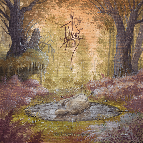
#9. Izthmi // The Arrows of Our Ways (artist: Vojtěch Doubek, Moonroot) — The cover for Izthmi’s debut looks like the climax of a dark historic fable. The arrows stuck out in all directions, the semi-symmetrical design, and the beautifully painted forest all contribute to the feeling that a terrible battle just ended in a violent ambush. Doubek’s use of muted autumn colors evokes a forlorn atmosphere, and it’s a gorgeous way for Izthmi to open what is hopefully a fruitful career.
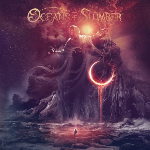
#8. Oceans of Slumber // Oceans of Slumber (artist: Giannis Nakos) — I’ll admit it, I am simply a sucker for the color here. The dripping, swirling, glowing patterns in purple and orange are jaw-dropping all on their own. But the subject matter is nothing to snark at, displaying one of the better examples of “tiny figure faces giant thing” I’ve seen in recent years, paying more attention to context and layout than most such covers do.
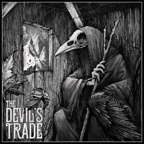
#7. The Devil’s Trade // The Call of the Iron Peak (artist: Robert Borbas, Grindesign) — Probably the most tattoo-ready cover of the year, it is probably not much of a surprise that Borbas a.k.a. Grindesign is a talented Hungarian tattoo artist as well as illustrator. The stark, haunting imagery has a beautiful lay-out, from the bird-skulled figure to the swirling leaves flying out the window toward the distant peak, and everything is rendered in exquisite detail with lovely sharp lighting and sketchy line work.
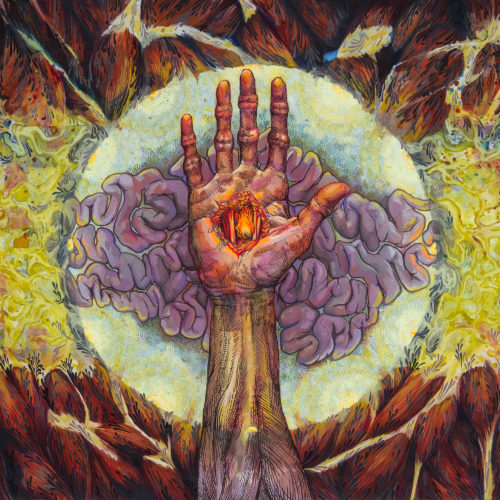
#6. Pyrrhon // Abscess Time (artist: Caroline Harrison) — Just like Pyrrhon’s music, Harrison’s artwork seems designed to spurn all the rules. Strange color combinations and a bizarre, multi-layered approach create an effect as repulsive as it is fascinating. Using various human tissues and a stigmatized hand, the oval composition recalls a human eye, but with many disgusting and inventive details woven in. A fittingly unnerving cover.
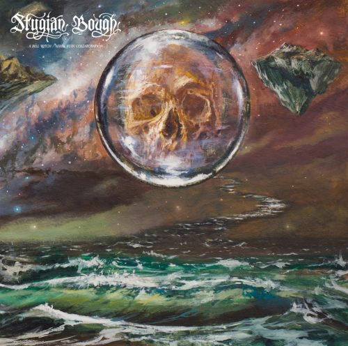
#5. Bell Witch / Aerial Ruin // Stygian Bough (artist: Adam Burke) — Some might say, no album art list is complete without Adam Burke. The king of sci-fi cosmoscapes certainly earned his place on this list with an ocean night sky. The otherworldly colors run into one another, creating an ambiguous horizon that can be placed in several different positions depending on how you look at it. It’s a beautiful painting and a visual illusion all rolled into one. With the skull-encasing crystal ball as its centerpiece, Burke’s created an engrossing and intriguing landscape to boggle and amaze the mind.
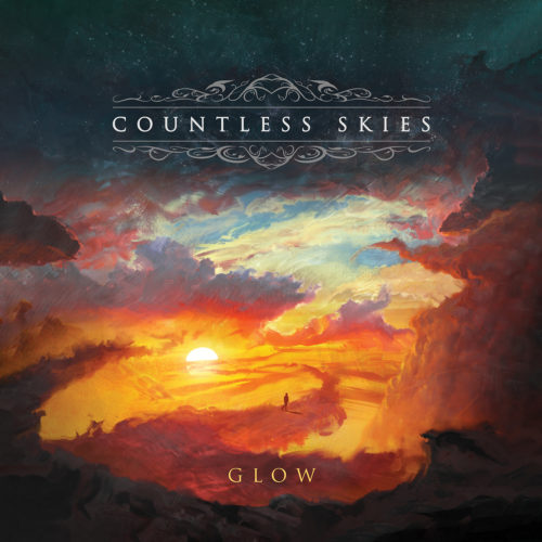
#4. Countless Skies // Glow (artist: Carl Ellis) — Subject-wise, Glow’s cover is not really anything special. A figure walking a path of clouds at sunset? I mean, it sounds like an alternate VHS cover for What Dreams May Come with Robin Williams. But the execution is just utterly gorgeous. Few paintings can replicate the awe of a lovely sunset, but Ellis has managed to capture that heart-stopping wonder perfectly with a spectacular display of color in a perfectly balanced layout.
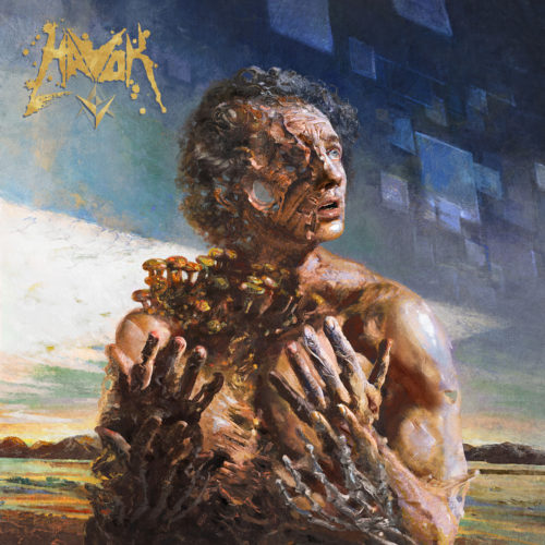
#3. Havok // V (artist: Eliran Kantor) — Sometimes I feel like Eliran Kantor is whom all metal album illustrators aspire to be. Though his style is recognizable, there is always something unique about every cover he creates. This magnificent piece of body horror is his strongest this year in a very good line-up. The fear and confusion are palpable, and the transformation is utterly otherworldly, with the shapes in the background seem to indicate something like a Borg-cube hanging in the sky. It is unique and as always, beautifully executed.
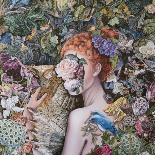
#2. Calyces // Impulse to Soar (artist: Maria Stergiou) — Striking, beautiful, and disturbing, in that order, are the effects of Maria Stergiou’s piece for Calyces’ Impulse to Soar. The initially striking reaction stems from the enormous amounts of organic detail, the wide array of slightly muted color, and the slightly unconventional layout. The beauty is apparent from the exquisite rendering of the many flowers, plants and animals, as well as the central figure. But the longer you look, the more disturbing the picture becomes. That the flowers do not mask her face, but replace it, is obvious, but how long did it take you to notice the blue bird has two heads? And how well have you studied the creature the woman holds? Stergiou’s painting seems to evolve the longer you look at it. What a fantastic piece.
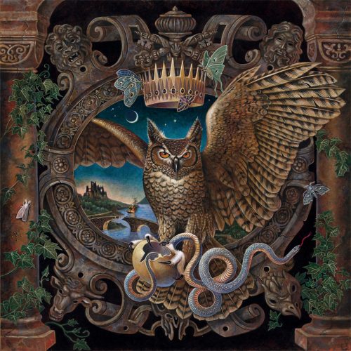
#1. Forlesen // Hierophant Violent (artist: Benjamin A. Vierling) — But not quite as fantastic as this year’s undisputed winner, the brilliant art that adorns Forlesen’s Hierophant Violent, courtesy of traditional painter and illustrator Benjamin A. Vierling. There is an almost geometric precision to the layout of the painting, yet it feels utterly alive, from the various creatures to the climbing plants and even including the distant landscape in the background. It looks on the one hand like a spectacular woodcut, but made even better by the subtly contrasting colors. The composition of the owl in the shield/window creates an illusion by which it seems to pop out of the painting, which makes it all the more striking. I would buy the vinyl of this album just to hang its art on the wall without ever even listening to the music. It truly is that good. A winner for the ages, Benjamin Vierling’s cover for Forlesen’s Hierophant Violent is the Angry Metal Guy Album Art of the Year 2020.
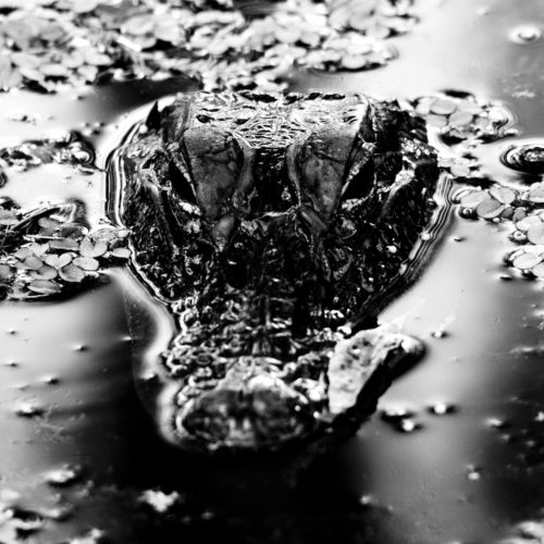
Best Photography: Many Blessings // Emanation Body (photo: Teddie Taylor) — I passed over this photo the first time. My thoughts went: “Uhm, okay, weird black thing in black puddle. Pass.” And pass I did. Then my attention was called back to it by Kronos. And then understanding dawned what exactly I was looking at and I practically recoiled in my seat. That is one evil looking gator, and it hit me right in the animal part of the brain. Not immediately recognizing it may even have improved upon the experience. A spectacular shot by Ms. Taylor and certainly the best photo cover we’ve seen this year.


